import pandas as pd
merged_df = pd.read_csv("./OR_year.csv")Oregon Dashboard
import folium
import plotly.express as px
import panel as pn
from IPython.display import HTML
from folium.plugins import MarkerCluster

n = folium.Map(location=[merged_df['LATITUDE'].mean(), merged_df['LONGITUDE'].mean()], zoom_start=6, tiles='CartoDB Dark_Matter')

# Create MarkerCluster
marker_cluster = folium.plugins.MarkerCluster().add_to(n)

for index, row in merged_df.iterrows():
    popup_text = f"<b>Precipitation:</b> {row['Precipitation']}<br>" \
                 f"<b>Wind Speed:</b> {row['Wind_Speed']}<br>" \
                 f"<b>Temperature:</b> {row['Temperature']}<br>" \
                 f"<b>Discovery Time:</b> {row['DISCOVERY_DATE']}<br>" \
                 f"<b>Fire Size:</b> {row['FIRE_SIZE']:.2f}"

    icon = folium.Icon(color='red', icon='circle', prefix='fa')  # Use red circle icons

    folium.Marker(location=[row['LATITUDE'], row['LONGITUDE']], popup=popup_text, icon=icon).add_to(marker_cluster)

n.save('wildfires_map_OR.html')

pn.extension()
folium_map_html = pn.pane.HTML('<iframe src="wildfires_map_OR.html" width="100%" height="600"></iframe>', width=800, height=600)
app = pn.Column("## Wildfires Map Oregon", folium_map_html)

app.servable()
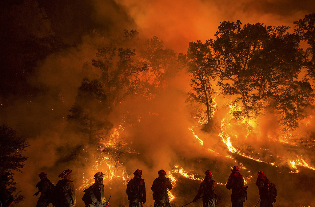
The visualization above presents an interactive dashboard that locates individual fires across Oregon recorded between 2014-15. To interact with the map, zoom into a specific location, then hover over a specific point to reveal important details about the fire (acreage burned and date of observation), as well as weather information (precipitation, temperature, and wind speed).
